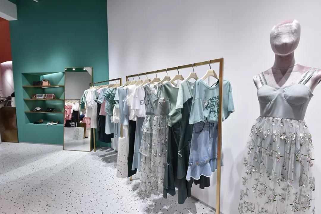
The color matching of clothing mannequins and props display is very important...

2. Color matching of color display of mannequins and props in retail clothing stores
1. Similar colors: a type of color, which means a color system, but the color purity and brightness are different, such as: light blue and dark blue.
2. Analogous colors are very simple, with similar colors, such as: beige and white. Analogous color combinations create a sense of softness and order. 3. Complementary colors: Two colors that contrast sharply, such as red and green. Their characteristic is their strong visual impact. 4. Contrasting colors: Pairing distant colors, such as red and yellow. Because contrasting and complementary colors create such a stark contrast, they need to be balanced with achromatic colors. It's worth noting that analogous, complementary, and contrasting colors complement each other in a store's color planning. If all the clothing, mannequins, and props in a store are in similar colors, it will feel too quiet and lack a sense of movement. Conversely, using too many contrasting colors can make people feel restless.

Editor's suggestion:
1. When matching clothing mannequin props with clothing:
① Light on top and dark on bottom: dignified, generous, quiet, serious
②Dark top and light bottom: bright, lively, cheerful, confident
③Highlight the top: the color of the pants should be slightly darker than the top (light top and dark bottom)
④Highlight the pants: the color of the top is slightly darker than the pants (dark top and light bottom)
2.
Rules for matching clothing mannequins and props:
① Horizontal pattern on top: pants cannot have vertical stripes or plaid
②When the top has vertical stripes: avoid wearing horizontal stripes or plaid pants
③When the top has a large or complex pattern: wear solid-color pants
④When the top has mixed colors: wear solid-color pants
⑤When the pants have mixed colors: avoid wearing mixed-color top